


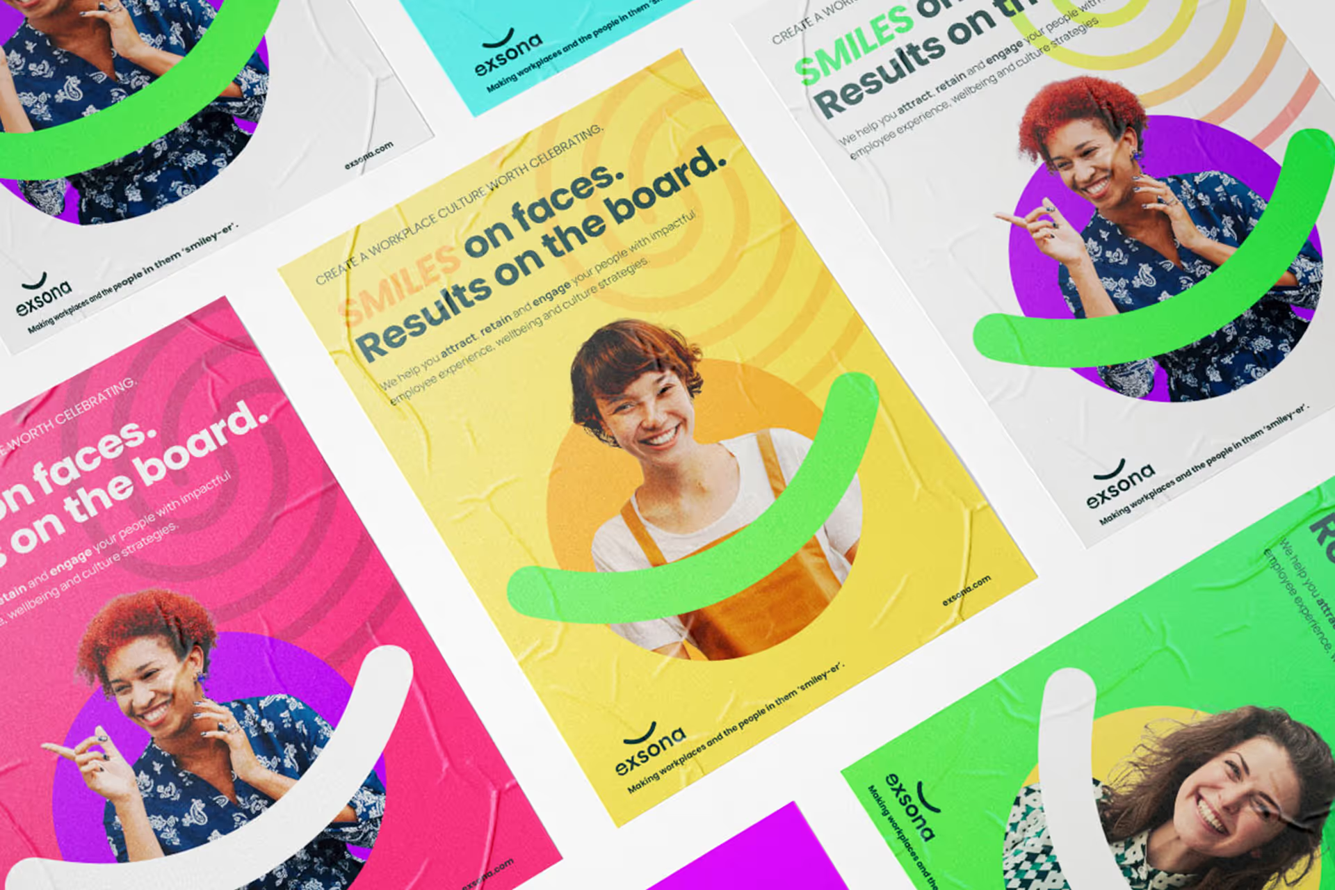
exsona helps organisations improve the experience of work: how they attract people, build culture, support wellbeing and keep good employees engaged. The people behind the business brought years of award-winning experience across workplace culture and employee engagement. But the brand wasn’t carrying the same credibility. Its identity was limited, difficult to extend and too easily lost among the corporate brands surrounding it.
We worked with founder Ryan McGrory to clarify who exsona needed to reach, what the business wanted to stand for and how it could communicate with greater confidence without losing its warmth. The resulting strategy and identity were built around a simple belief: happier workplaces work better.
The existing identity made an experienced business look smaller than it was. It relied heavily on a single colour, had few supporting elements and lacked the broader system Ryan needed for proposals, presentations, social media and other everyday communication.
The category created another problem. Workplace consultancies often presented themselves through restrained corporate design, while wellbeing brands tended to borrow the same soft colours and reassuring visual language. Neither direction reflected exsona. Making the brand feel more credible didn’t require making it more conventional. It needed to hold its own alongside larger consultancies while preserving the directness, humour and humanity that made working with exsona different.
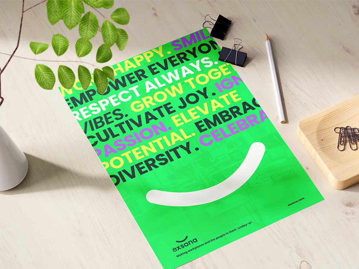
We help improve culture and wellbeing at work with simple strategies that put smiles on faces and results on the board.
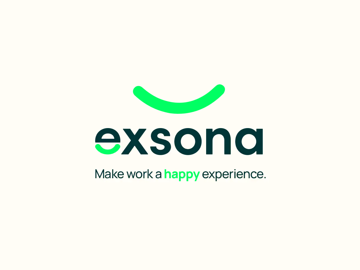
The central idea was already present in the name. Sona means happy in Irish, and happiness sat at the heart of exsona’s belief about work: people and organisations perform better when employees feel supported, valued and able to contribute. We made that idea visible by turning the lowercase “e” in the exsona wordmark into a smile. It was simple enough to understand immediately, distinctive enough to be remembered and flexible enough to become more than a standalone logo.
The smile became the starting point for a broader identity system. A bold palette brought energy to a category dominated by cautious colour. Fingerprint patterns represented individuality and the mark each person leaves on an organisation. People-first photography placed employees, their personalities and their relationships at the centre of the brand. These elements weren’t added to make exsona appear cheerful. Together, they expressed a more serious proposition: workplace culture is shaped by how people experience work every day.
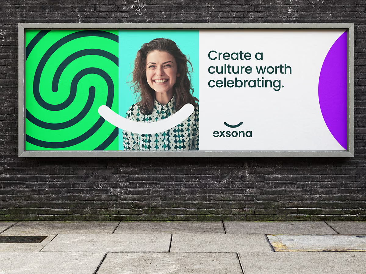
The rebrand gave exsona a clearer story, a recognisable visual idea and a more flexible system for expressing the personality behind the work.
Just as importantly, the identity was designed to be usable. Ryan wanted a brand he could apply himself without losing its coherence. The simplicity of the smile, the broader colour palette, the supporting patterns and the photography direction gave him more freedom to create everyday materials while keeping them recognisably exsona.
It gave the business a more confident way to enter conversations, present its expertise and be remembered.
Services
Brand Strategy, Brand Identity, Brand Messaging, Web Design
Industry
Workplace Culture / HR Consultancy
Year
2024
Website
Visit siteIn their words
“It's rare to work with someone who understands (and can deliver on) both design and strategy work. He took things to the next level. Over-delivered on everything, and put my business in a much better place. 100% recommend.”


