



Dr Priyanka Naidu came from a research background, but her true interest was in confidence, resilience, and wellbeing. She had a new clear sense of purpose: to create the resources she wished she'd had access to at a younger age. Tools that could help young people build mental strength before life demanded it.
But there was a gap between what she was building and how she was showing up. Her old brand, "Interested in Research," was a leftover from an earlier chapter. It was too academic, and didn't come close to capturing who she'd become or what she was trying to do.
Research remained essential to Priyanka’s work, but it wasn’t the reason people would seek her out. They were looking for practical ways to build confidence, understand themselves and navigate fear, perfectionism and self-doubt. The name Interested in Research kept that value at a distance. It made the work sound academic and observational, while Priyanka’s real strength was making complex psychological ideas accessible, useful and encouraging.
The opportunity lay in a combination that few wellbeing brands could hold credibly. Priyanka could bring together evidence and empathy, academic expertise and lived experience, and serious psychological thinking with a sense of optimism and play.
The brand needed to preserve the authority of the research without making wellbeing feel clinical or complicated.
The idea of design gave the brand a more active role. Priyanka wasn’t simply explaining wellbeing or prescribing a single version of a better life. She was giving people the knowledge and tools to make more deliberate choices about their confidence, resilience and personal growth.
That led to the name The Wellbeing Designer. It positioned Priyanka as someone who could translate evidence into practical experiences, while encouraging people to become active participants in shaping their own wellbeing. The idea extended into the line “Live life in bold and italics.”
Bold for courage, the willingness to stand out, take risks, and chase what matters. Italics for individuality, the confidence to show up as yourself, without apology.
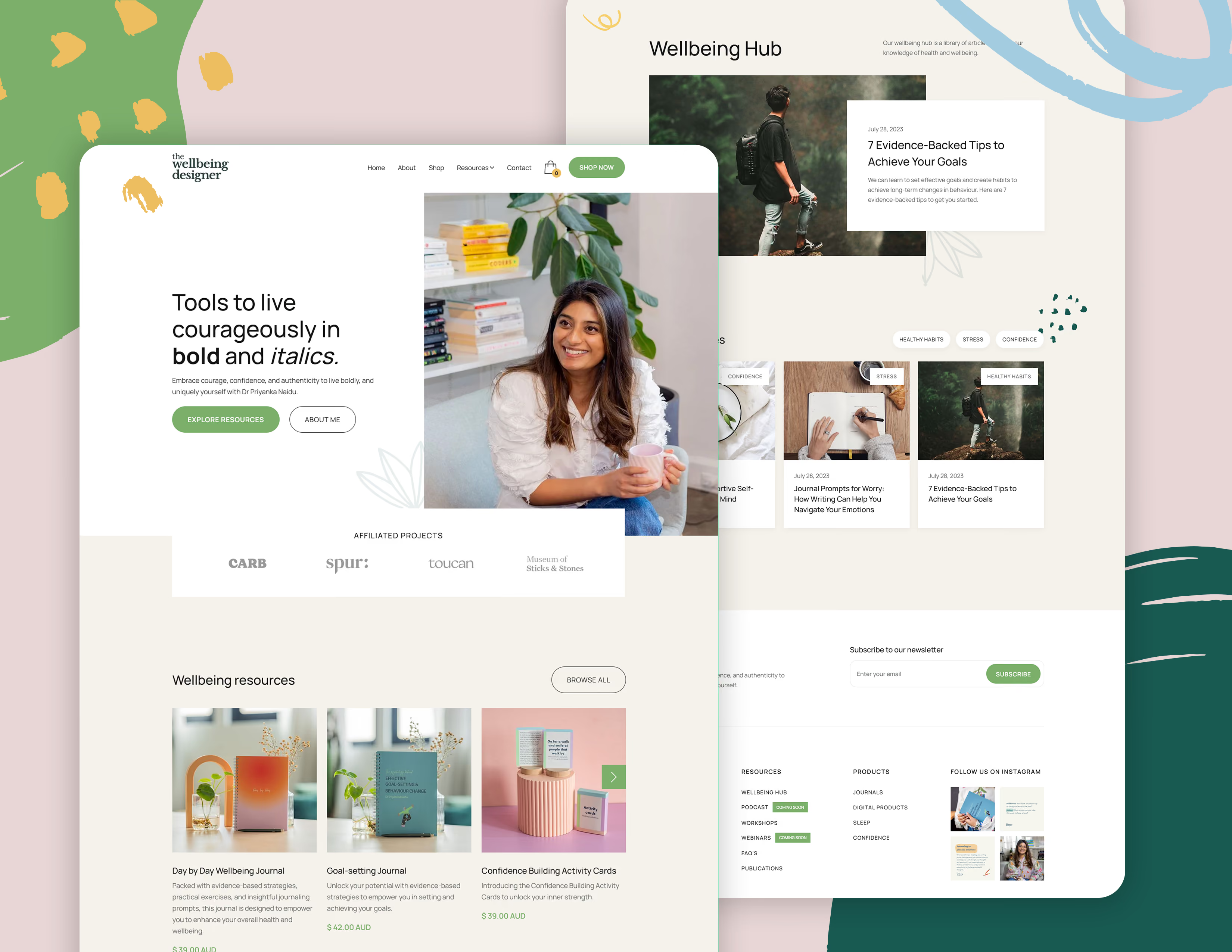
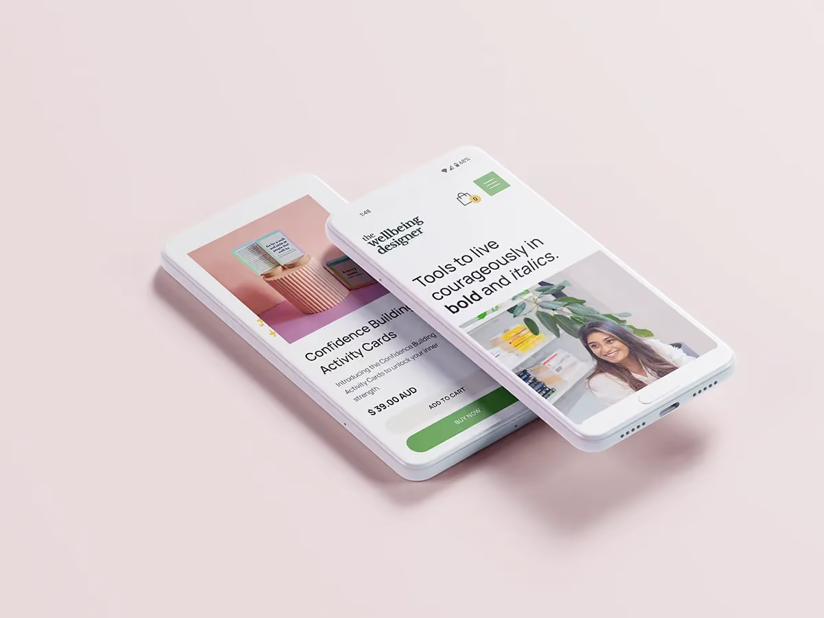
The visual identity brought that philosophy to life through expressive typography, confident colour and a new warm, optimistic digital experience.
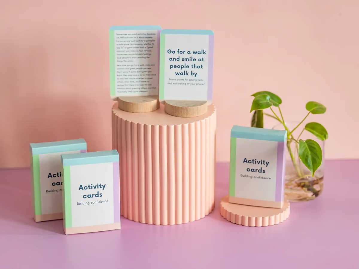
The new brand gave Priyanka more than a clearer way to introduce herself. It created an idea capable of holding together the different ways she wanted to help people. The brand has continued to carry that work. The website still leads with the invitation to live in bold and italics, while the wider offer now includes Confidence Toolkit workshops for young people, wellbeing journals, confidence-building activity cards, research publications and an expanding Wellbeing Hub.
Services
Brand Strategy, Brand Identity, Web Design, Templates & Assets, Ongoing Support
Industry
Health & Wellbeing
Year
2024
Website
Visit siteIn their words
“Massive thanks Adam for crafting a digital space that feels like me, supports my goals, and for helping me uncover the values that underpin my work. It was such a joy to work with you!”


