


Customer Story
Living in bold and italics: A brand built on living courageously
results
120
%
Increase in sales

Dr Priyanka Naidu came from a research background, but her true interest was in confidence, resilience, and wellbeing. She had a new clear sense of purpose: to create the resources she wished she'd had access to at a younger age. Tools that could help young people build mental strength before life demanded it. Support that wasn't clinical or complicated, just practical, warm, and grounded in real evidence.
But there was a gap between what she was building and how she was showing up. Her old brand, "Interested in Research," was a leftover from an earlier chapter. It was too academic, and didn't come close to capturing who she'd become or what she was trying to do. She wasn't just interested in research anymore. She was interested in designing tools for real people to live better lives.
We started by asking deeper questions. What did she stand for? What made her approach different? What did she want people to feel when they found her? That process surfaced something important: she wasn't just educating people on wellbeing. She was helping them design it for themselves. That's where The Wellbeing Designer came from.
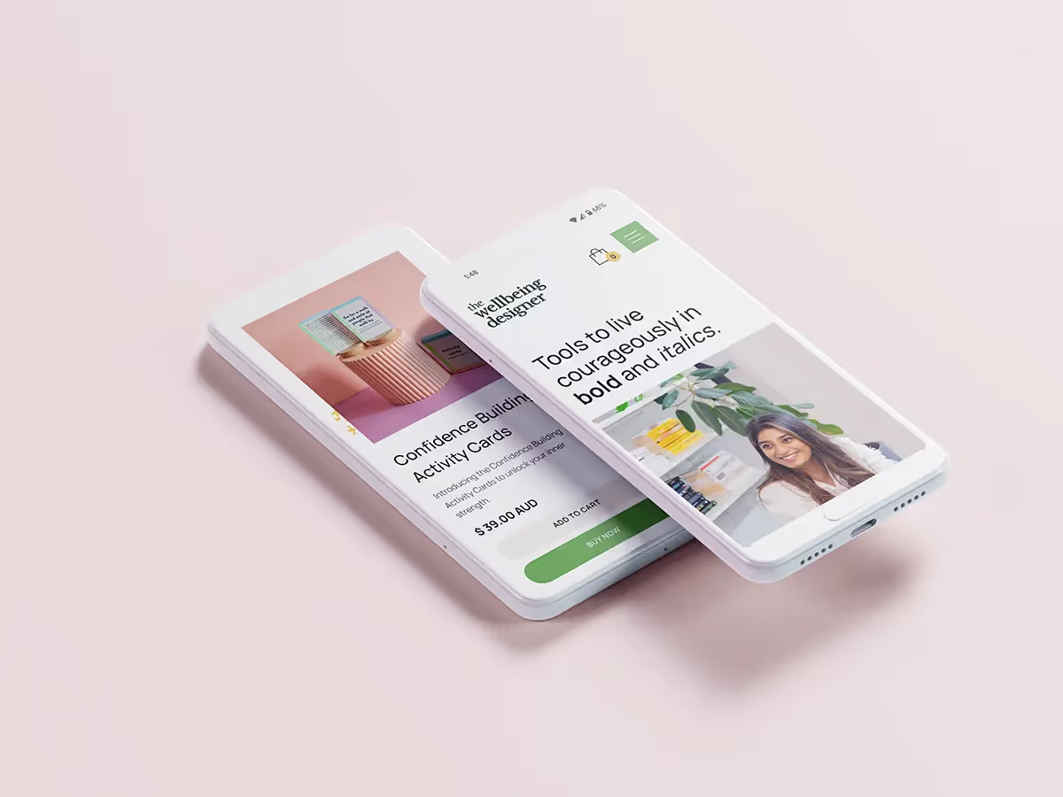
From there, the identity followed. A bold colour palette and modern typography that matched her energy. A website that felt warm and optimistic, not clinical or cold. And a tagline that captured the whole philosophy: "Live life in bold and italics."
Bold for courage — the willingness to stand out, take risks, and chase what matters. Italics for individuality — the confidence to show up as yourself, without apology. The entire point of her work, distilled into five words.
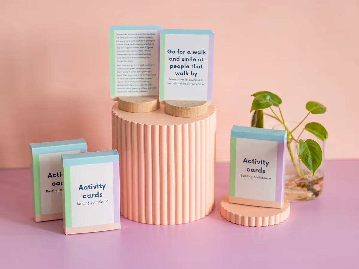
Today, The Wellbeing Designer is a brand that actually reflects the person behind it. Dr Priyanka runs Confidence Workshops for young people, has built a library of journals, activity cards, and resources and educated and coaches people around the world. It's all designed to help others build the mental toolkit she once wished she had. And now, the brand matches the mission.

%201.svg)