




Most business insurance runs on the same three assumptions: that owners have an hour to spare, a broker willing to take their call, and a working knowledge of what "professional indemnity" actually covers. EasiCover was built to remove all three.
EasiCover is an AI-powered insurance platform for Australian small businesses, matching owners with occupation-specific cover in minutes. We worked with the EasiCover team to build the brand strategy, identity and website that would carry that promise.
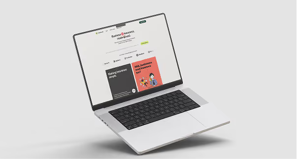
Every insurance brand sells the same underlying promise: we've got you covered if it goes wrong in language measured enough to sound like it was written by the legal team. Easicover wanted to take a different approach. To build something that speaks directly to their audience of Australian small business owners.
That's a harder brief than it sounds, because personality cuts both ways here. Lean too far into cheeky and irreverent, and a business owner sorting out their public liability starts wondering if you're taking their risk seriously. Play it safe, and you're just another beige insurance brand nobody remembers choosing. EasiCover needed to sit right in the middle of that: distinctive enough to notice, warm enough to like, and still credible enough to trust with something that genuinely matters if it goes wrong.
Additionally, there was a regulatory layer running underneath all of this. As a platform providing general advice under its AFSL rather than personal recommendations, EasiCover couldn't just sound informal, it had to be precise about what it was actually offering. That didn't create the core challenge, but it did narrow the room to move in while we solved it.
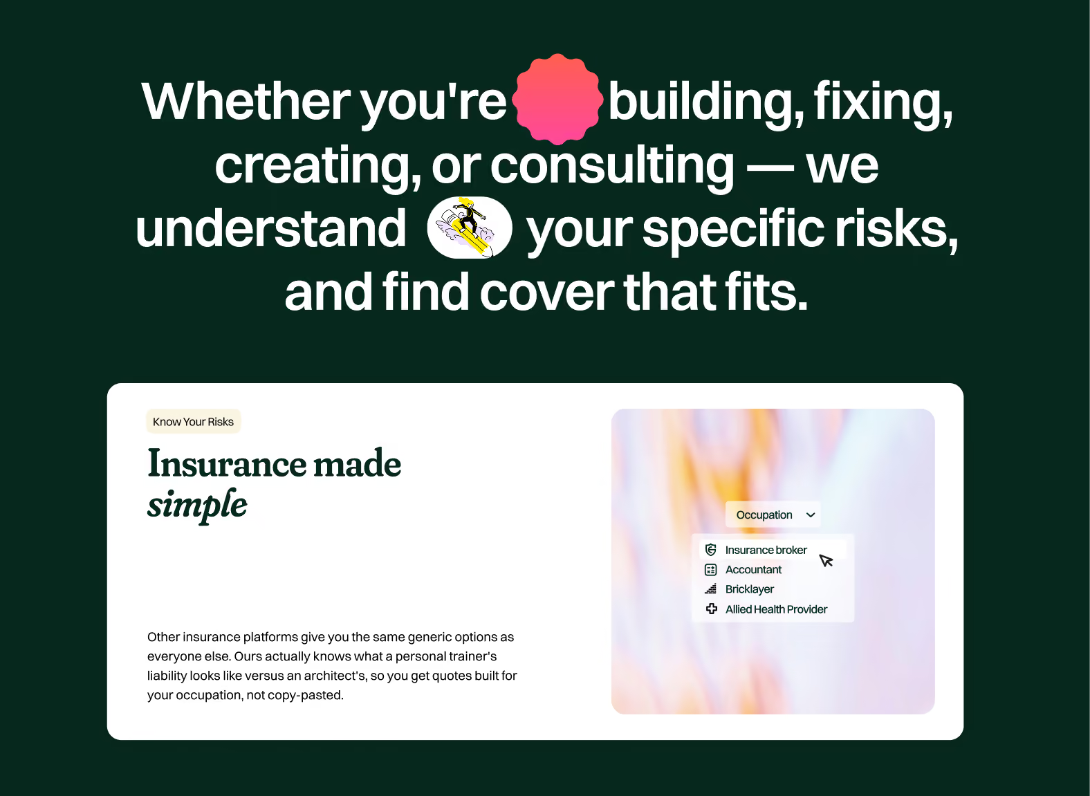
The brand archetypes we landed on were the Sage and the Jester. Neither archetype on its own would have worked. Together, they set a tone that could hold both jobs at once: a switched-on mate who knows their stuff, confident enough to call out industry nonsense, plain-spoken enough to never leave a business owner more confused than when they arrived. You can learn more about brand archetypes here.
The identity had to earn that tone visually. We built around a stamp and badge motif. Something that reads as a mark of approval, paired with a confident wordmark and an illustrated style over stock photography. Th palette went vibrant on purpose: lime, black, blue, orange, yellow and pink, a deliberate step away from the beige-and-navy conservatism the rest of the category defaults to. The regulatory boundary shaped the solution as much as the tone did. Every line of copy had to clear a simple test: does this sound like a recommendation, or an explanation? The brand's confidence had to come from clarity rather than claims.

EasiCover is live, built and launched on the brand strategy, identity and website developed through this project. It's early days for EasiCover as a business. But the brand it launched with already sounds and looks like the platform it set out to build: direct, genuinely useful, and a bit cheeky.




%201.svg)